BUPA consultant finder
Bupa Finder sees 40%+ of BUPA UK's traffic flow to it. I rapidly UX redesigned this core aspect of Bupa's web site.
8597 views
1 minute read
Overview
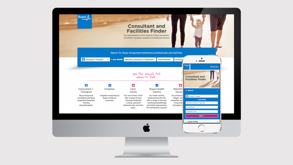
Bupa Finder is a key service offered by Bupa to its customers and perspective customers.
It enables those people to find out which consultant they can use in which area and at which hospital within their cover.
40%+ of Bupa UK's overall traffic goes to this section of the site.
The challenge
This project needed to be completed in a very short period of time.
I was chosen for the task, due to my no-nonsense approach.
Less than 2 months was given to complete things to an MVP point.
So we ended up running many of tasks in parallel in an extreme agile fashion.
Visual design was done in tandem with UX Design and Information Architecture, as well as user stories writing.
Back end and front end work was also being run as parallel task based on early wireframes and structural outlines.
Daily updates were used to ensure that project was being done a congruent way.
Wireframes
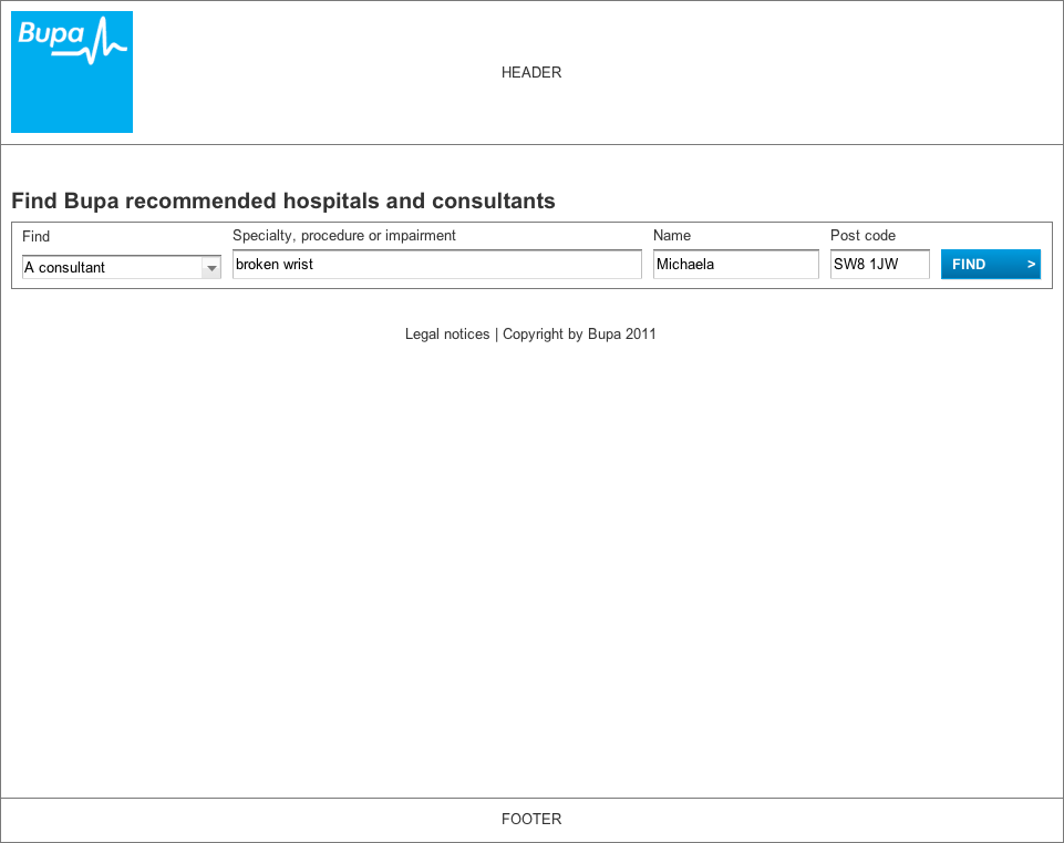
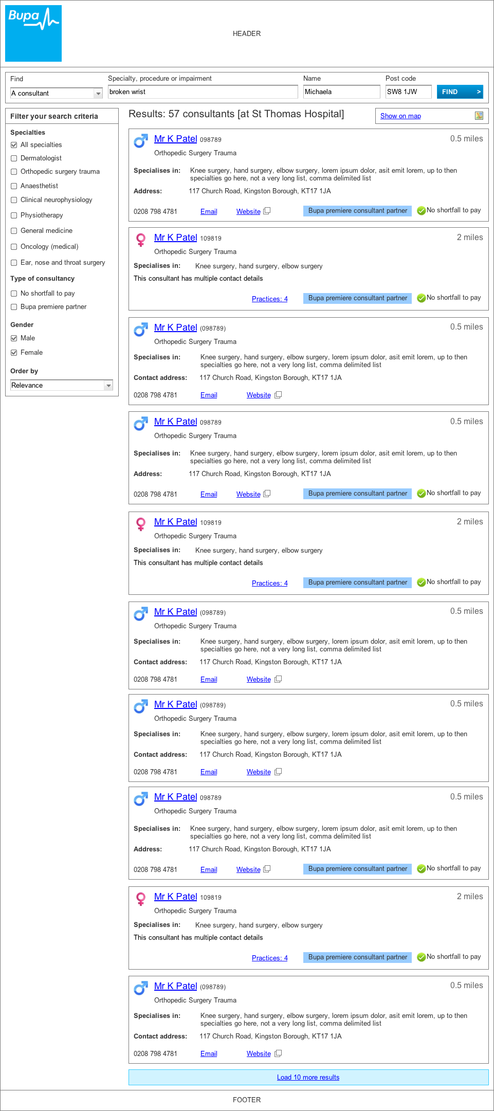
I did some early rapid sketches for the solution, but moved onto the wireframes very quickly after that.
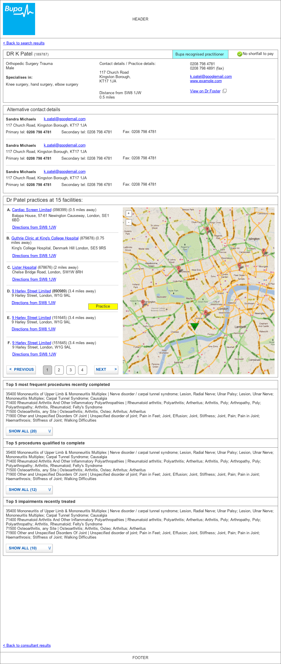
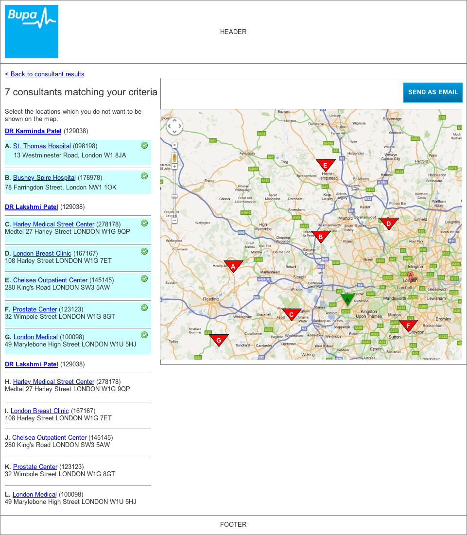
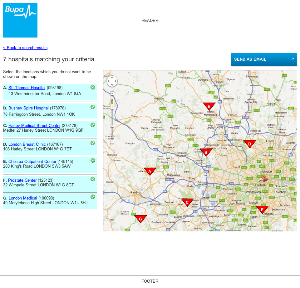
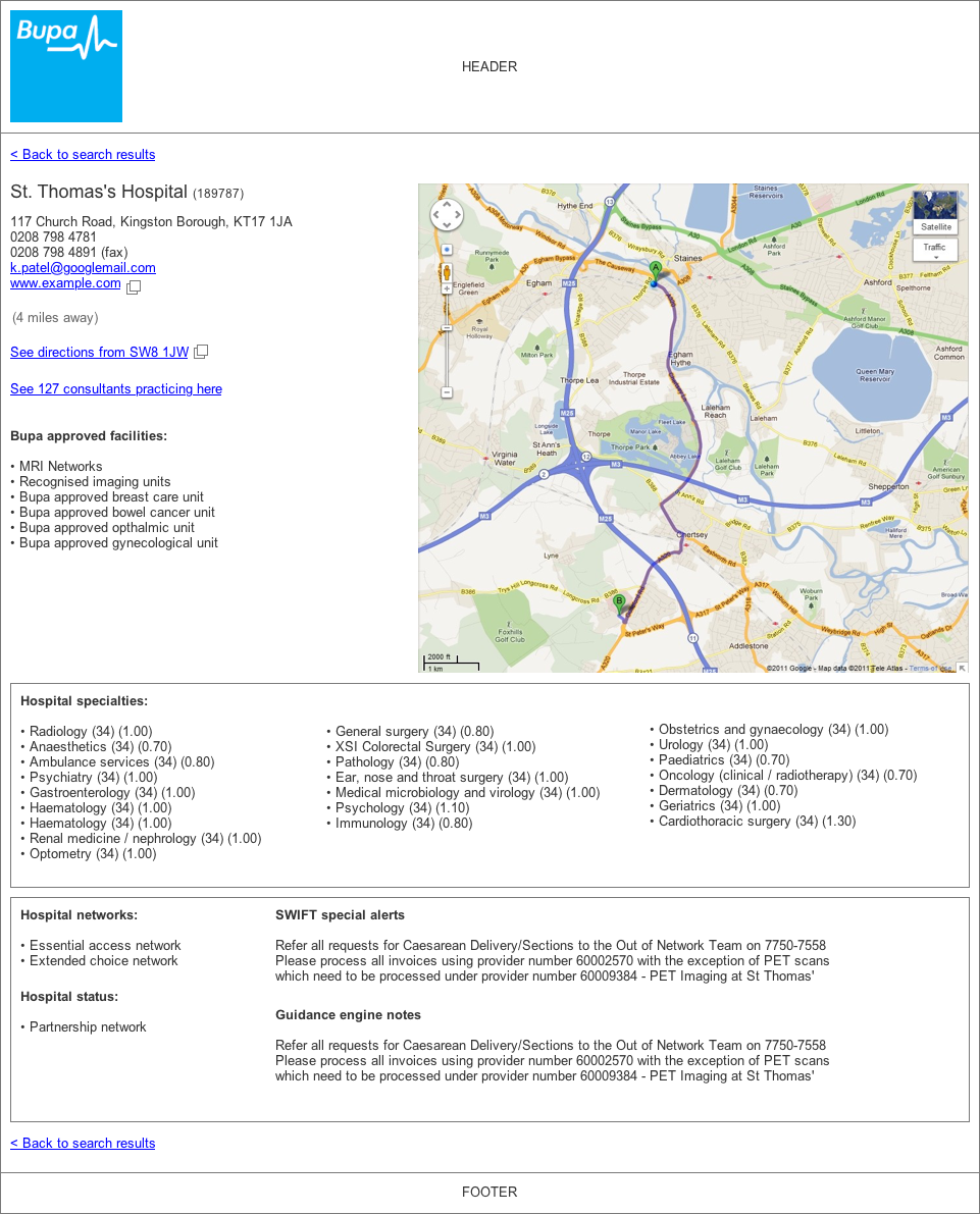
Final designs
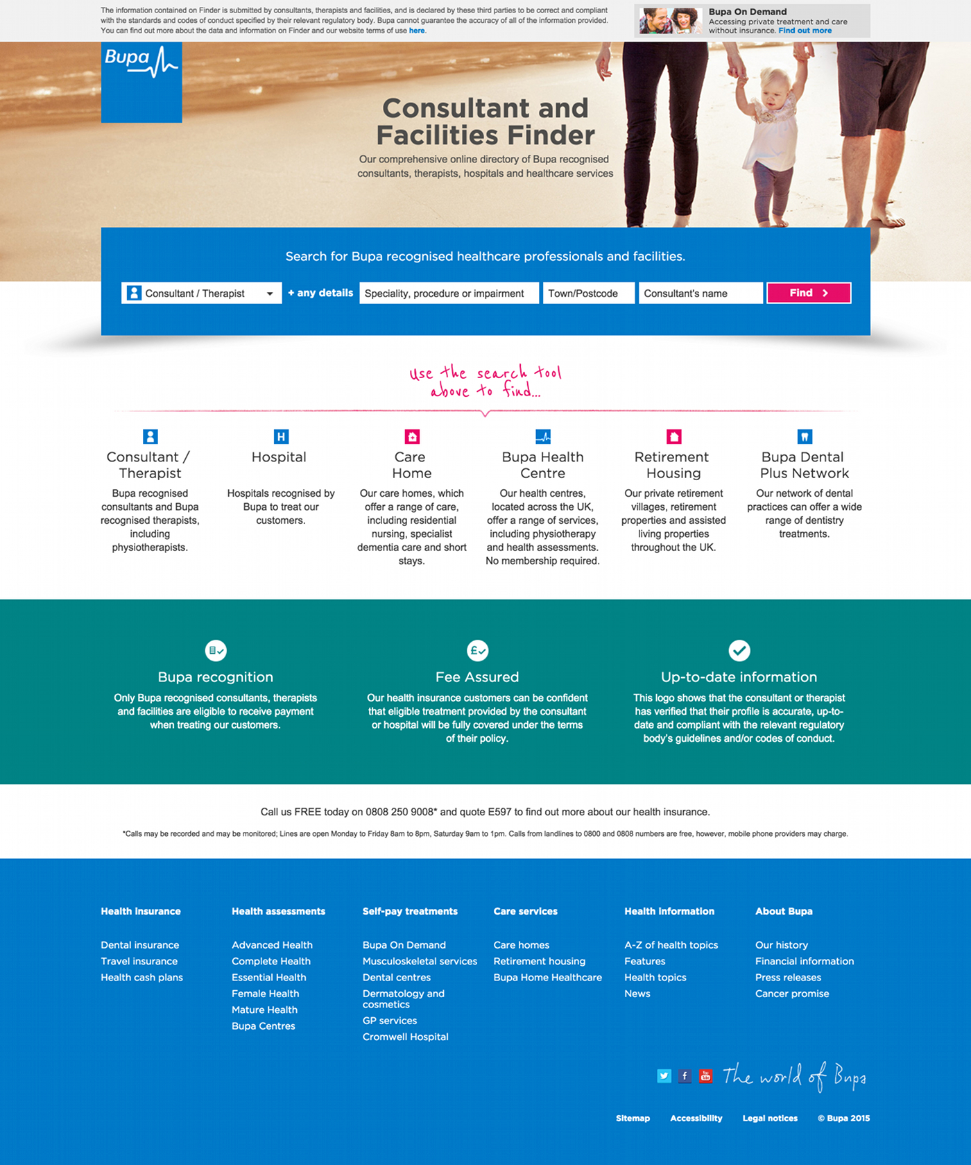
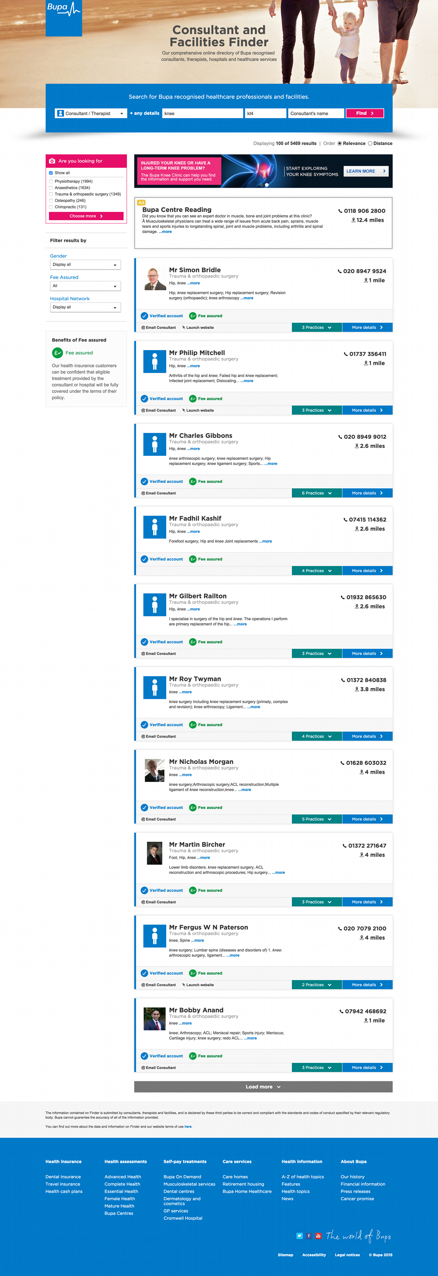
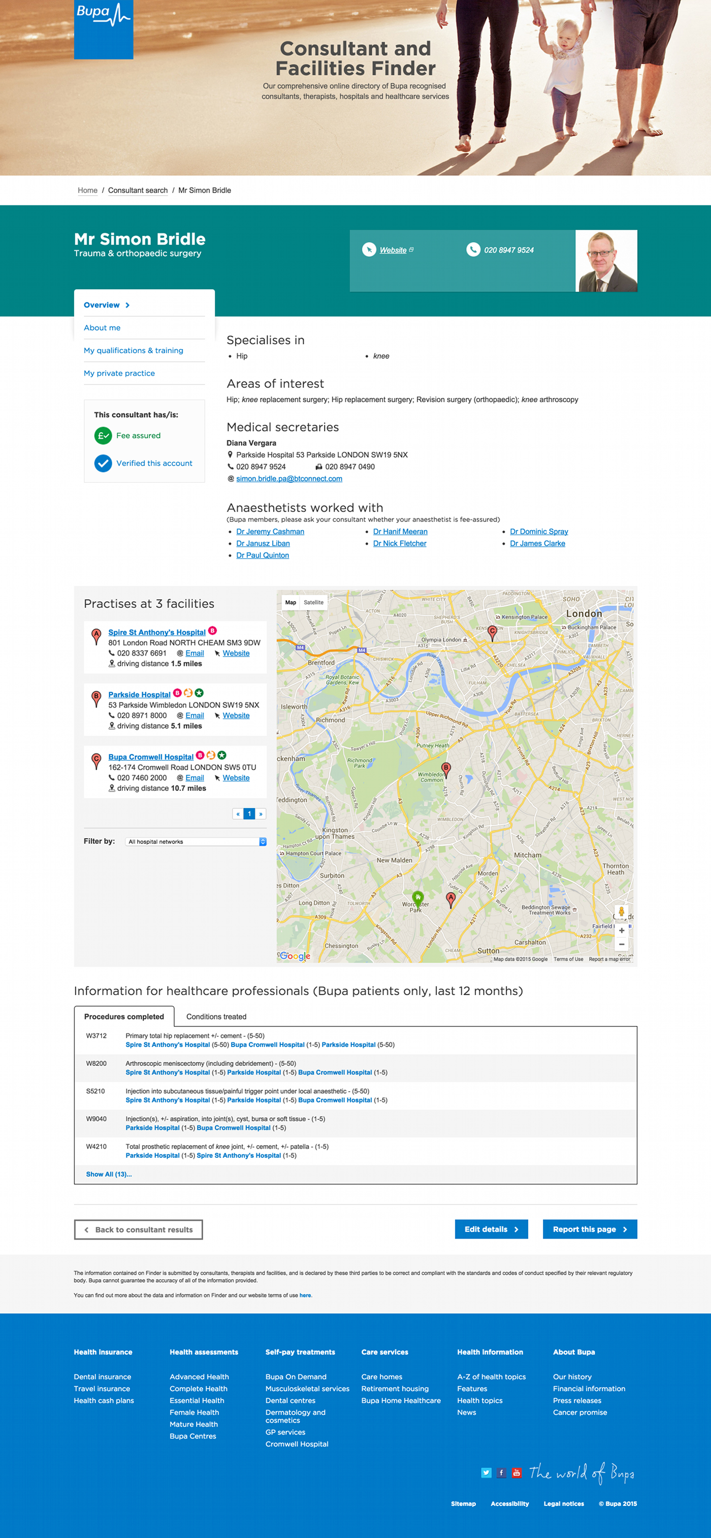
Even though Bupa Finder was designed in 2011, it is still going strong as designed back then.
Interestingly the visual and UX design can be described as having a look and feel very similar to Google Material Design, which came many years after Bupa Finder.
Published on: 20 Oct 2015
