HSBC global digital transformation
HSBC embarked on a global transformation programme redesigning majority of their online consumer banking with modern UX guidelines in mind.
7006 views
2 minute read
Introduction
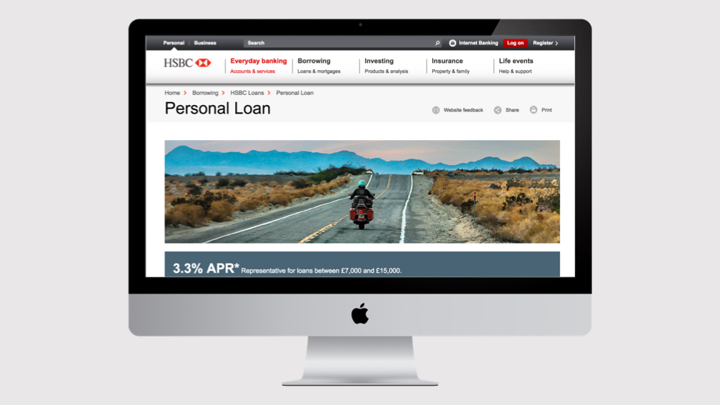
The enormity of HSBC programme was huge.
It involved 27 programmes running in parallel.
The aim was to redesign the entirety of HSBC's online consumer banking offering.
We used a mobile first approach with standardised pattern library.
This was to create consistency and comply to latest UX best practices.
I worked with a range of UX Designers, Product Owners, Developers and Business Analysts to ensure creation of the best possible solution.
In the end I worked on 3 separate programmes: Account Opening, Mortgage Application and Personal Loan Application.
Sketches
Each new pattern of interaction I explored in sketches first.
Much of the design challenge on HSBC was around big forms design.
We worked on making inputs as streamlined as possible.
Form usability was of utter importance.
The loan calculator was the trickiest widget to design, with much scope for misunderstanding on user side.
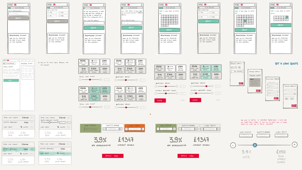
The nature of the loan product(s) was that it needed to be very clear what was on offer.
I explored this quite a bit before honing in on the right solution.
I also explored alternative ways of designing form altogether.
This was with intent of making these forms compliant with future possible chat bot based banking.
Pattern library
To streamline the creation of wireframes I created a pattern library for Axure.
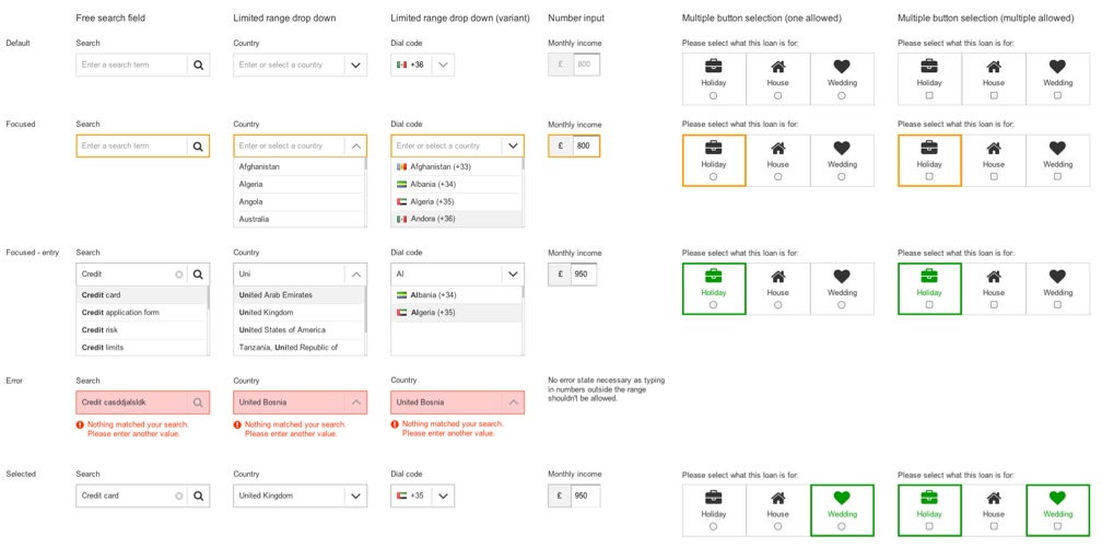
This was a task which was on HSBC's backlog for 6 months before I joined.
I produced the pattern library within 2 weeks.
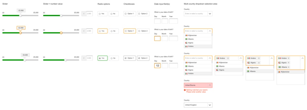
It quickly became a standard part of the toolkit for all UX Designers across different departments.
Wireframes
Much of the work on HSBC was about heavy wire framing and capturing of business rules in visual form.
Many pages in the forms have a set of variants which needed handling.
Wireframes played a crucial role in enabling Product Owners to get a crucial sign-off in moving the projects forward.
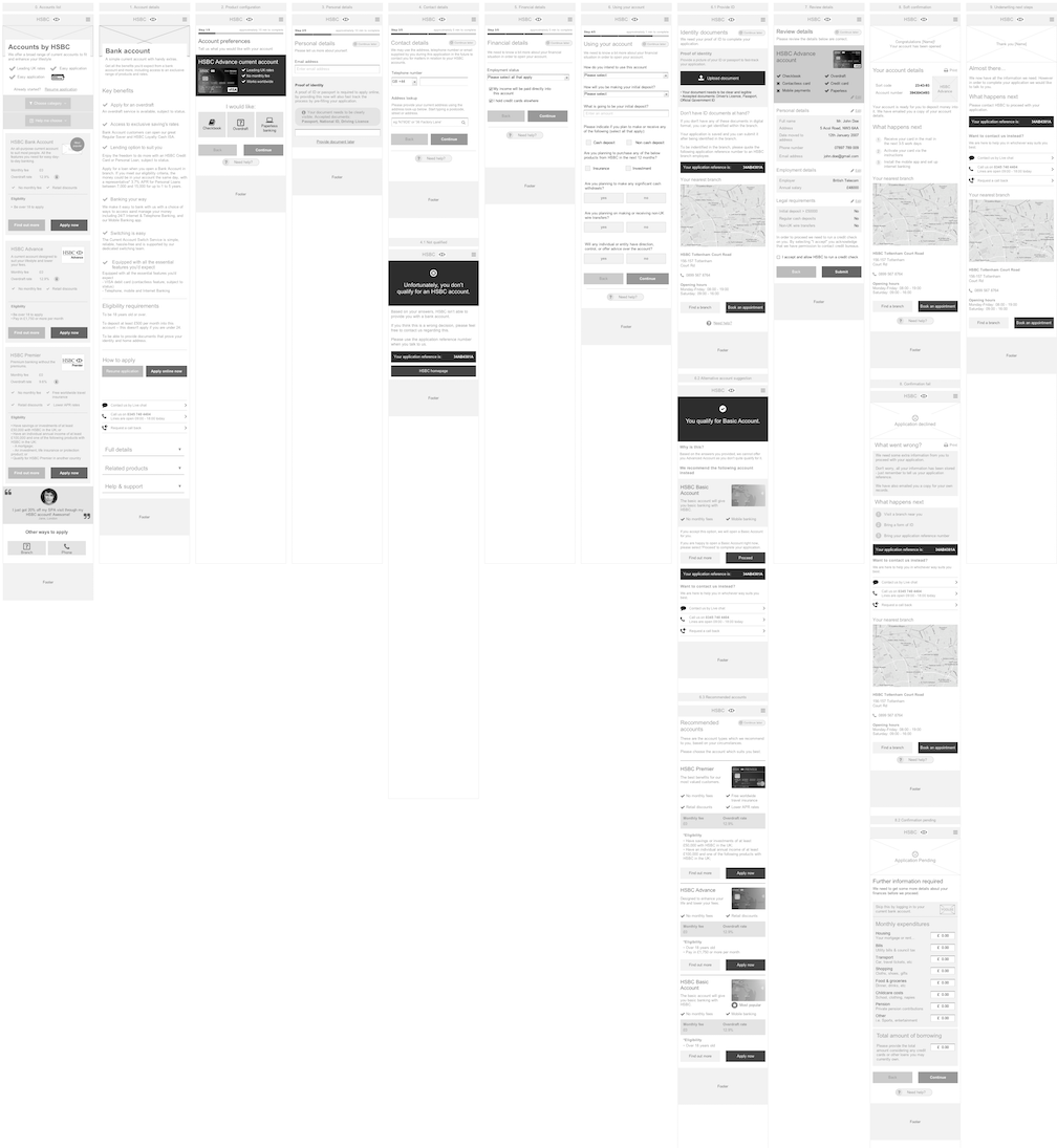
I worked with front end prototyper to convert my wire flows into working prototypes, ready for user testing.
Using the pattern library, wireframing was pretty rapid, consistent and accurate.
It worked very well to align UX Design and developer work flows.
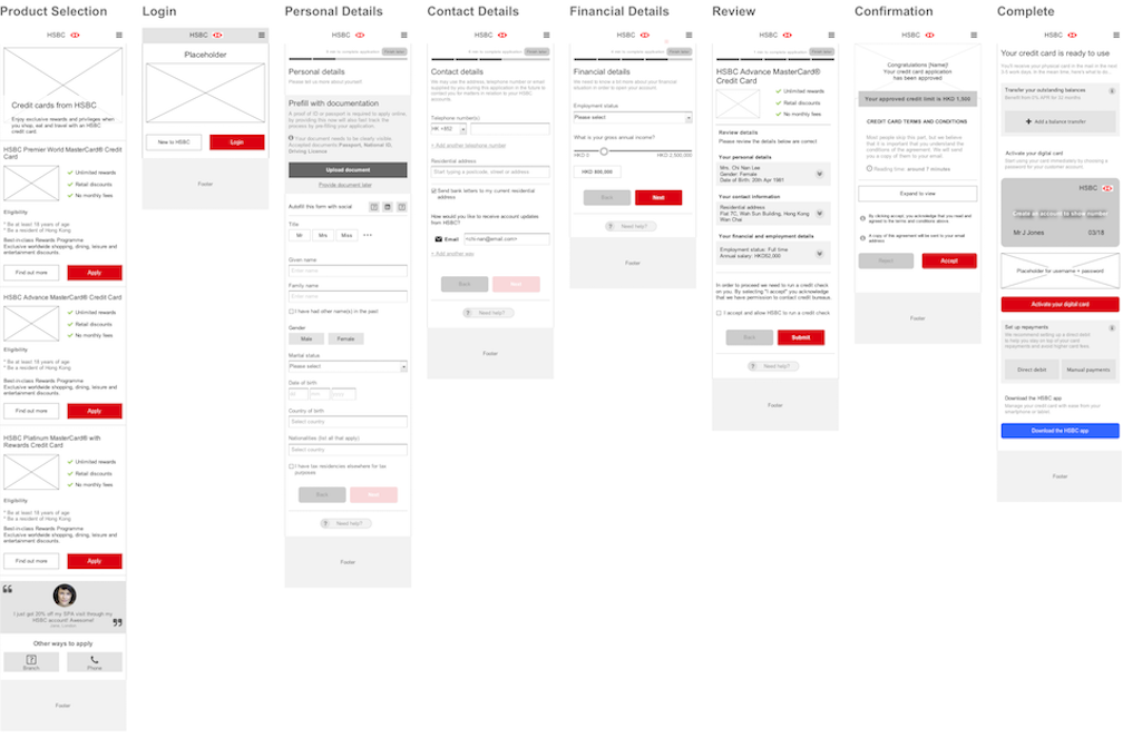
Prototypes and user testing
We used quite high fidelity prototypes to user test thoroughly at FoolProof user testing agency.
Prototypes were coded in responsive, mobile first HTML and CSS based on my wireframes.
Published on: 19 Feb 2017

